Ever found yourself cruising down the highway, catching a glimpse of a billboard that made you do a double take? You know, the kind that makes you slam on the brakes just to take it all in? Well, my friend, that's the magic of good billboard design.
In a world cluttered with information and distractions, creating a billboard that stands out is like mastering the art of a perfectly brewed cup of coffee – it requires the right blend of elements. So, grab your creative hat and let's dive into what makes a billboard a roadside masterpiece!
1. Less is More:
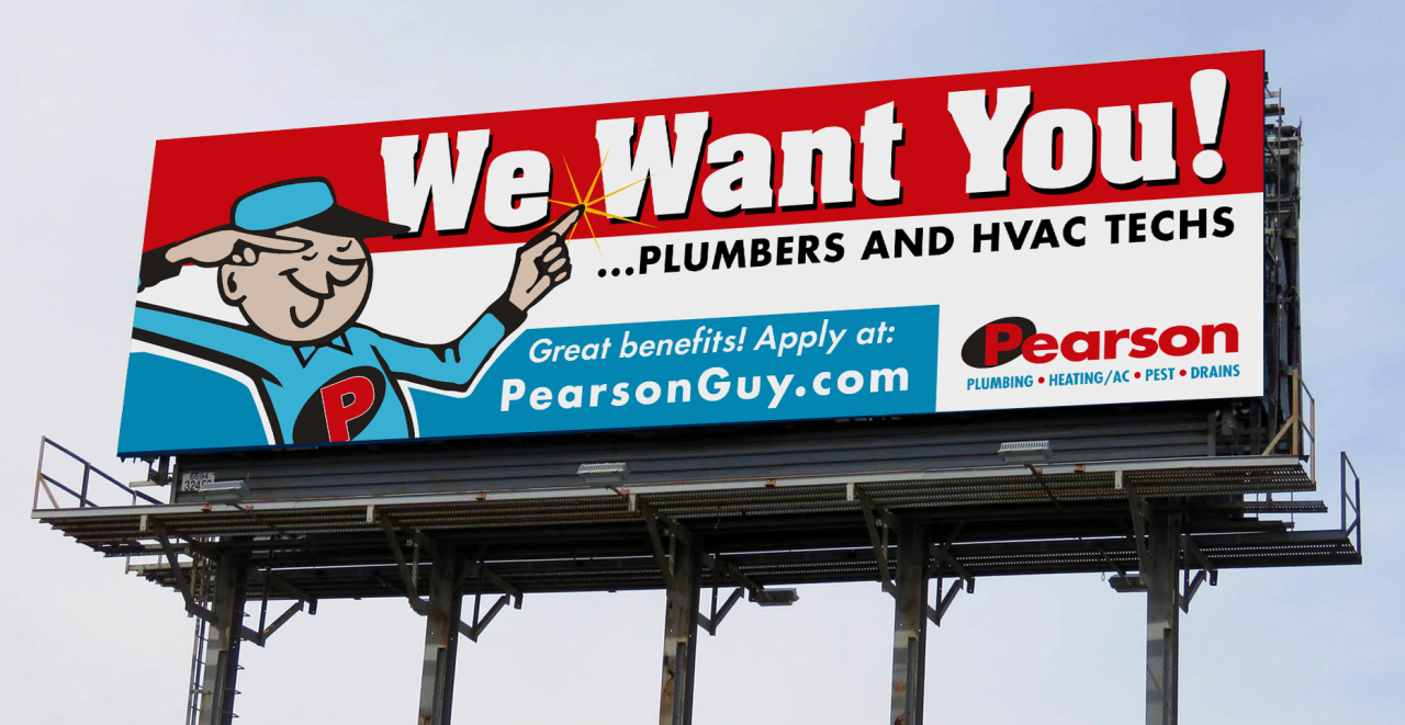
Imagine you're driving at a breezy 65 mph (or maybe a little faster, we won't tell). You've got about 5 seconds to make an impression. That's right – 5 seconds! So, keep it simple. A clear message, bold fonts, and minimal clutter will ensure your audience gets the gist without causing a traffic jam.
2. Eye-Catching Imagery:
A picture is worth a thousand words, and on a billboard, it's worth even more. Choose images that resonate with your audience and are easy to understand. Bonus points for creativity – make 'em say, "Wow, I never thought a toothpaste ad could look so cool!"
3. Colors that Pop:
Picture this: a gray billboard against a gray sky. Yawn, right? Inject some color into your design! Vibrant hues can grab attention and make your billboard memorable. Just be careful not to blind anyone – unless, of course, you're advertising sunglasses.
4. The Font Matters:
No one wants to squint while zooming down the highway. Opt for bold, easy-to-read fonts. Remember, it's not the time for fancy calligraphy – unless you're targeting a niche market of art enthusiasts with excellent eyesight.
5. Location, Location, Location:
Just like in real estate, the placement of your billboard matters. Consider the surroundings – is it a busy intersection, a scenic drive, or a stretch of open road? Tailor your design to complement the environment and catch the right eyes.
6. Make 'Em Smile:
Humor is the secret sauce of great billboard design. A witty tagline or a clever visual pun can turn heads and leave a positive impression. Just be sure it's universally funny – we don't want confused drivers trying to decipher your joke.
In the grand scheme of advertising, a billboard is your 50-foot canvas on the open road. It's a chance to be bold, be seen, and be remembered. So, the next time you're brainstorming that billboard design, channel your inner Picasso-meets-stand-up-comedian and let the creativity flow!


