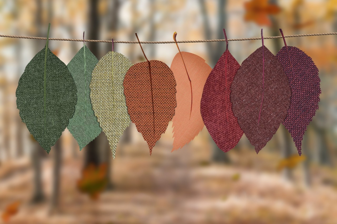
If you’re anything like us, you’re over summer. The weather might not have gotten the memo yet, but we’re ready for fall! So, grab your pumpkin spice latte because today we're delving into the mesmerizing world of fall colors and their incredible power to shape emotions. As the leaves turn from green to gold, let's explore how you can harness the psychological impact of autumn hues to curate the ultimate color palette for your campaigns. Get ready to captivate your audience's senses—let's jump in!
Unveiling the Psychology Behind Fall Colors
Autumn isn't just a season; it's a feast for the eyes and a journey for the soul. The deep oranges, warm reds, rustic browns, and mellow yellows that paint the landscape during this time hold a special place in our hearts. But what's the science behind our infatuation with fall colors? It's all about psychology.
1. Orange: The Warm Embrace of Excitement
Ah, orange—the undeniable emblem of fall. This vibrant hue ignites feelings of enthusiasm, energy, and warmth. It's perfect for campaigns that aim to evoke a sense of excitement and adventure. Whether you're promoting a thrilling event or a limited-time offer, orange hues in your palette can set hearts racing and eyes sparkling.
2. Red: The Bold Agent of Passion
Bold and fiery, red captures attention like no other. It's the color of passion, courage, and determination. Incorporating red tones into your palette can infuse your campaign with a sense of urgency, making it ideal for flash sales or product launches where you want your audience to act swiftly.
3. Brown: The Earthy Grounding of Reliability
Brown, with its grounding and earthy vibes, symbolizes reliability and stability. This color is an excellent choice when you want to create a sense of trust, especially for campaigns centered around long-term commitments or services that provide a sense of security.
4. Yellow: The Joyful Elixir of Positivity
Radiant and joyful, yellow exudes positivity and happiness. It's the color of sunny days and warm smiles. Integrating yellow into your palette can uplift your audience's spirits and evoke feelings of optimism, making it an excellent choice for spreading cheer in your campaigns.
Crafting Your Perfect Fall Palette
Now that we've unlocked the emotional language of fall colors, let's talk about weaving them together to create a harmonious and impactful color palette for your campaigns.
1. Balance is Key
Just like a painter expertly blends colors on a canvas, striking the right balance is essential. Incorporate a mix of these fall shades to capture the diverse emotions you want to evoke. A well-balanced palette resonates more profoundly and offers a holistic experience to your audience.
2. Audience-Centric Approach
Consider your target audience's preferences, interests, and cultural associations with specific colors. Remember that colors can evoke different emotions across cultures, so tailor your palette to resonate with your intended audience.
3. Context is Everything
While fall colors hold immense power, context matters. Align your chosen palette with your brand's identity and the message you're trying to convey. A cohesive blend of fall colors with your brand's aesthetic will create a visually appealing and emotionally resonant campaign.
From the fiery passion of red to the earthy reliability of brown, these hues are your tools to craft unforgettable campaigns that resonate deeply with your audience. So, fellow marketers, go forth and paint your campaigns with the palette of autumn's emotions. Happy marketing, and here's to a season of captivating connections!


