My wife, a high school educator, was picking out her outfit for the next day’s work. She brought me the outfit she was putting together and asked me, “Does this match?” Instead of the traditional husband answer of “yes” (always the safest one), my answer was a typical answer of a graphic designer. I provided a detailed explanation that utilized my background in design to describe my reasoning of why the colors of her outfit don’t match. Amazingly enough, after my thorough explanation of color theory, she thanked me. She still asks me occasionally for advice on her outfits but not as much. I think she is either afraid of a long-winded response or figuring it out on her own.
Whether it be with patterns or colors, everybody utilizes matching skills in everyday life. So, is there a right way to match or is it by personal choice? My answer is a simple “YES”. It is both a personal choice and a correct way combined. For example: when designing for a client, one of the many questions to ask is a color preference. They may not prefer certain colors because it is used by a competitor or just a color they never liked. It is the task of a graphic designer to make the client’s choices of colors work whether they are compatible or not.
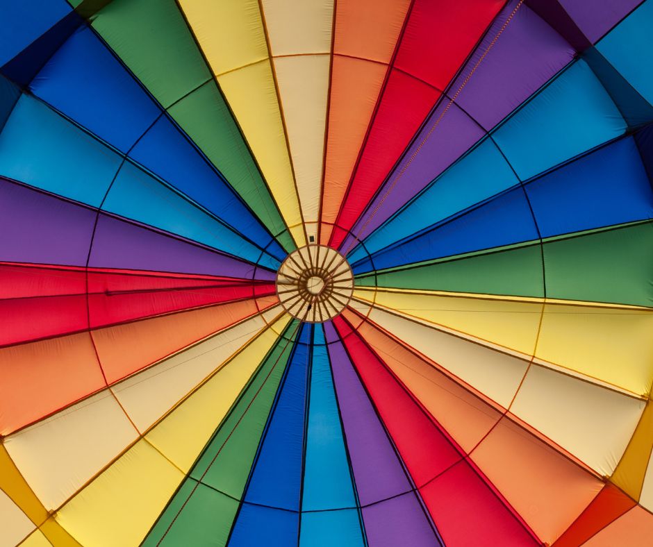
One choice of compatibility might be warm colors (reds, yellows, oranges, etc.) together or cool colors (greens, blues, purples, etc.), mostly because they share a common mix of colors. The use of a color wheel can be very helpful in the process. It will show those compatibilities using primary and secondary colors. Once you have your colors figured out, try using variations of them. Instead of green use a lime green, instead of red try a burgundy for a richer look.
Once the color choices have been made, your next variable relies on your audience. What is your client’s focus group? Is it moms, young children, teens, or elderly? If you decide on red, yellow, or orange, the primary bright versions may work for the young crowd but for parents or a slightly older audience, richer colors are ideal. Such as a deeper red like a burgundy, or a deeper version of yellow like ochre or a brighter rust for orange. For the elderly, perhaps choose a toned down or muted version of those colors to create a peaceful aesthetic.
So does it match? Ask the client and if they are unsure, make subtle suggestions and comparisons. Some may think they know; some may need a little push in the right direction and others may claim defeat and ask the expert (you) for advice.